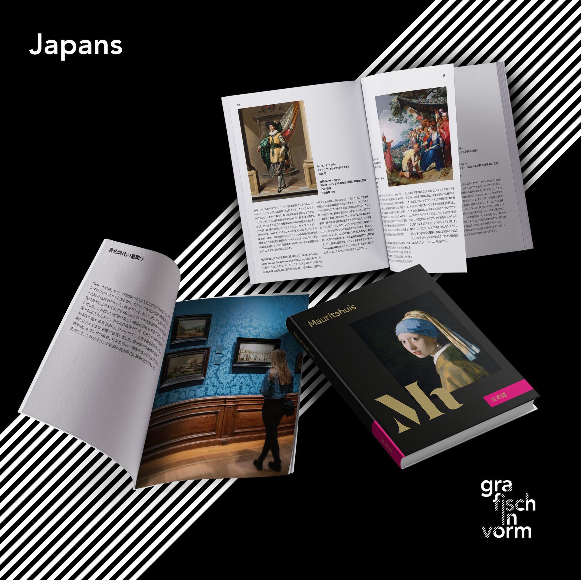
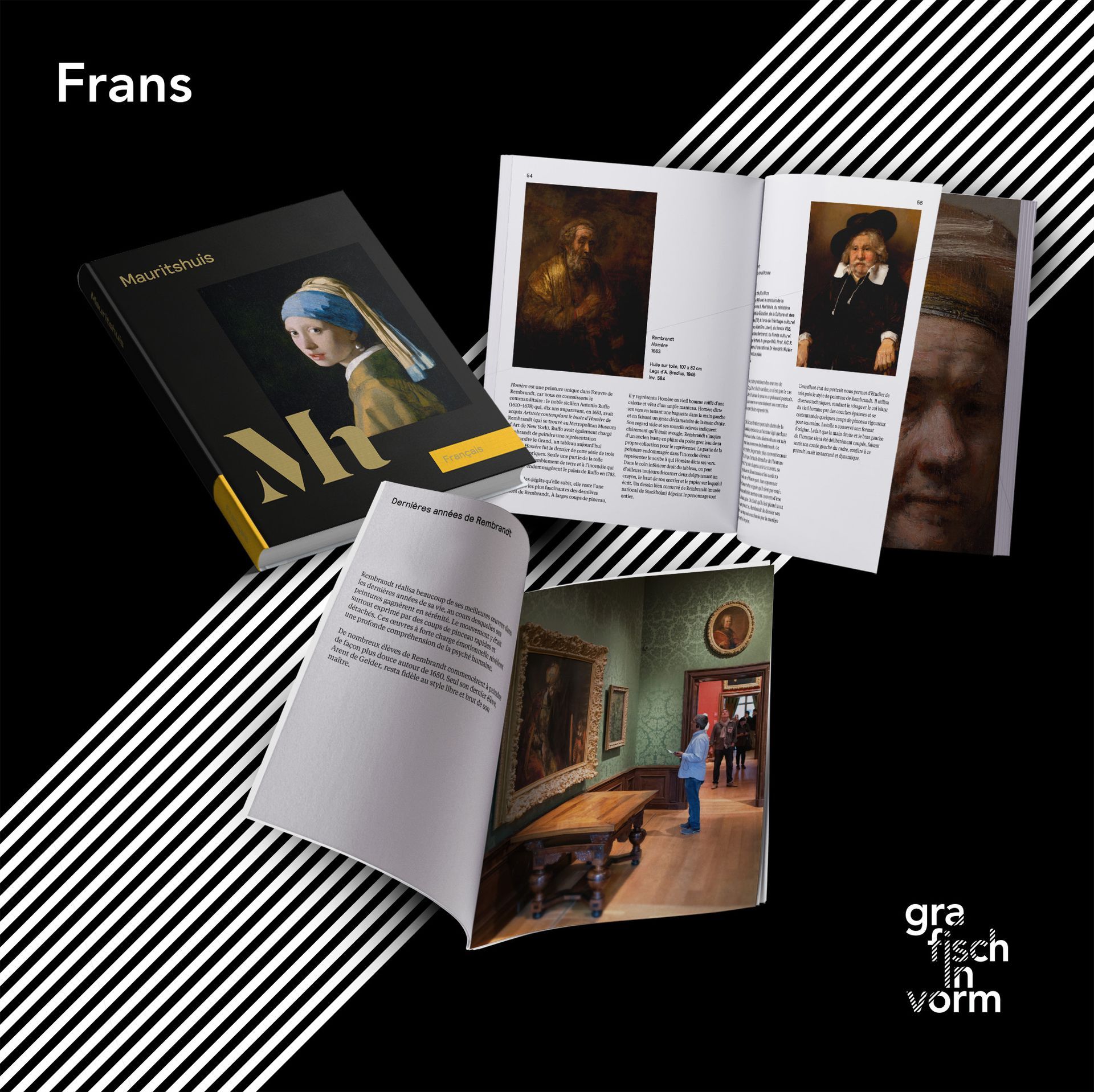
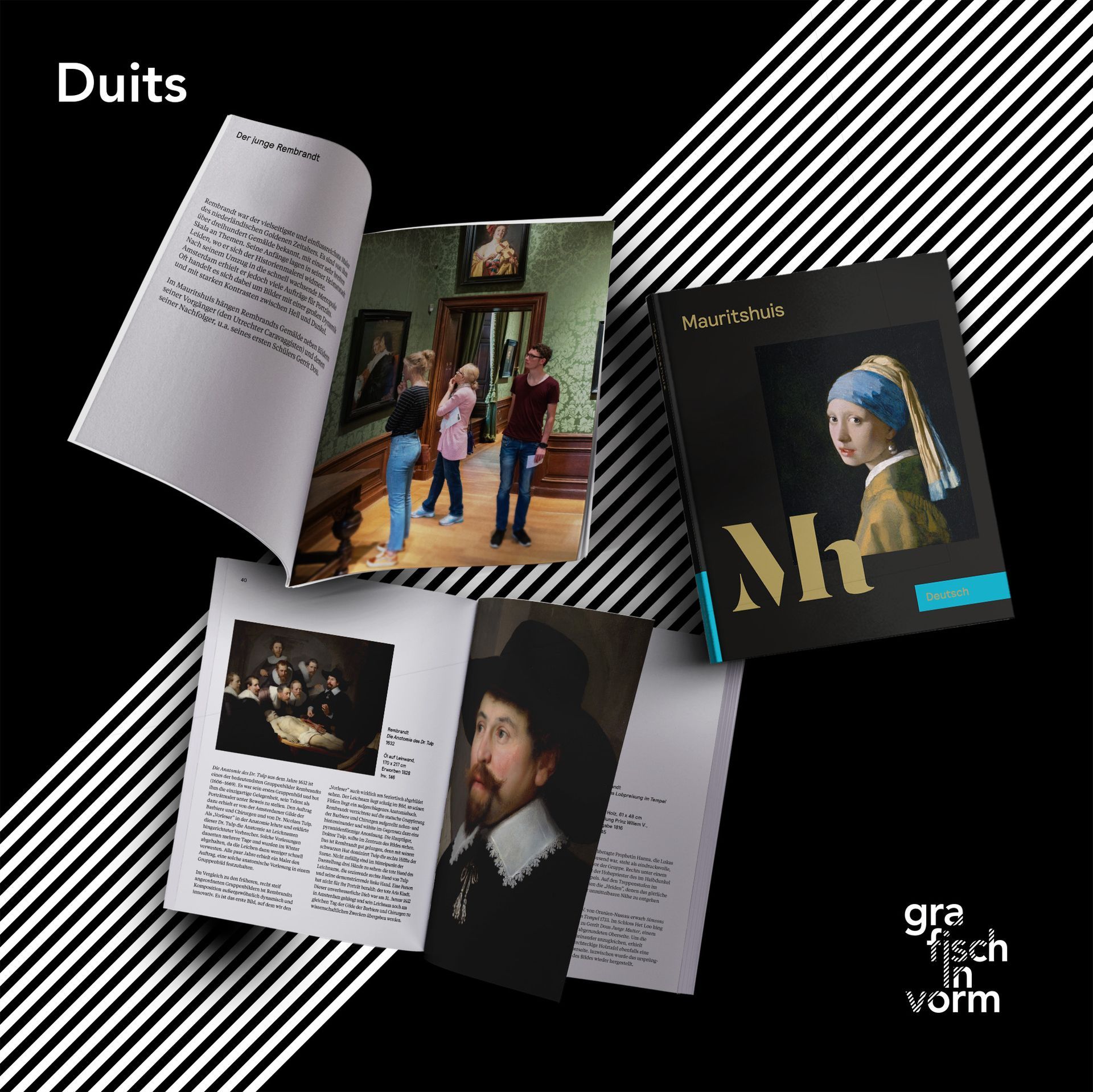
Mauritshuis // Translations of the book 'Highlights'
Mauritshuis
Translations and working drawings of the book Highlights
Collaboration with Studio Dumbar
about this project
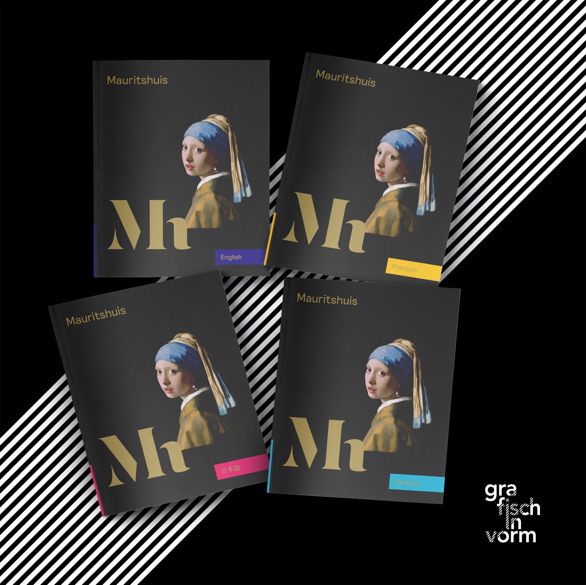
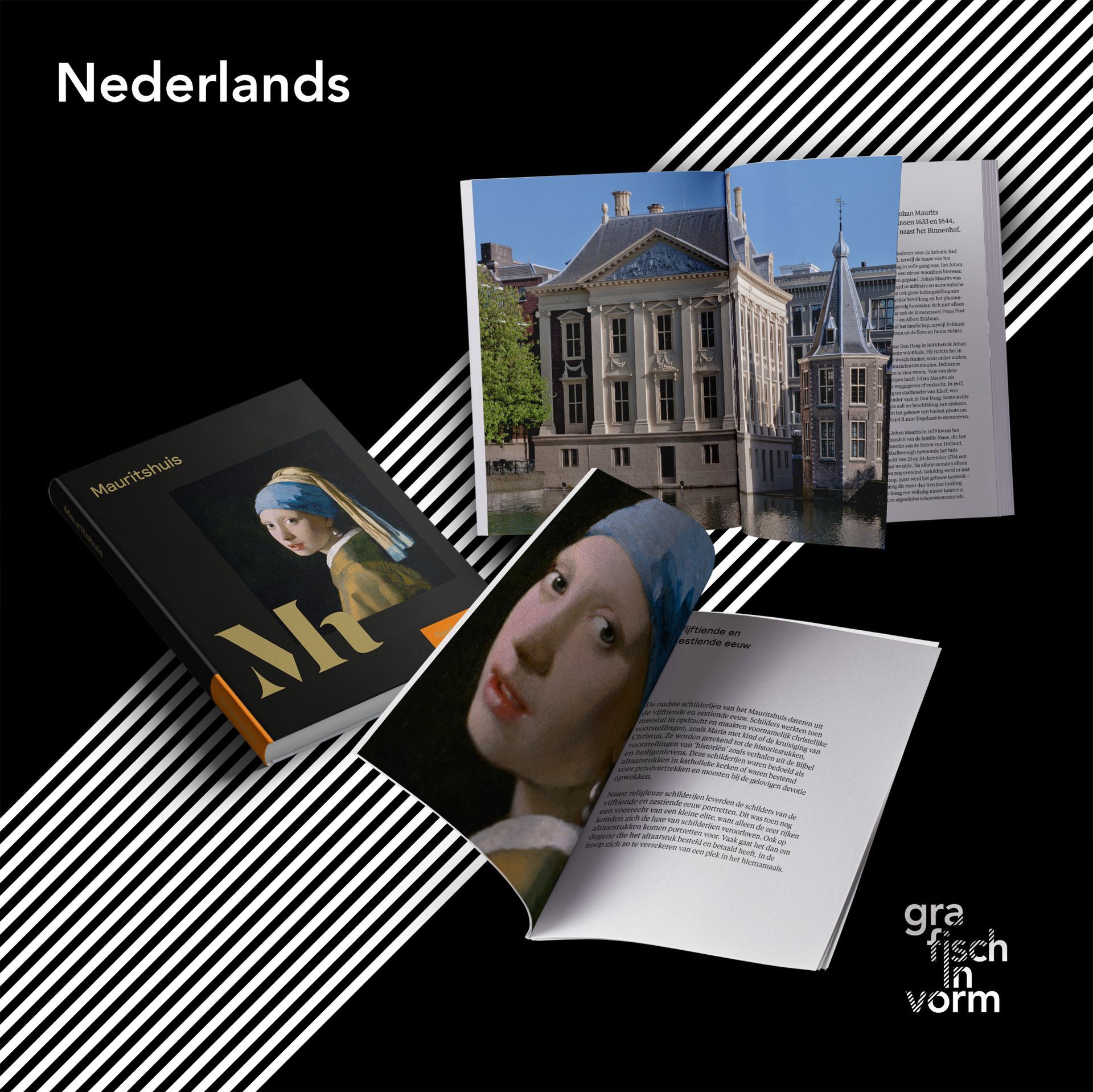
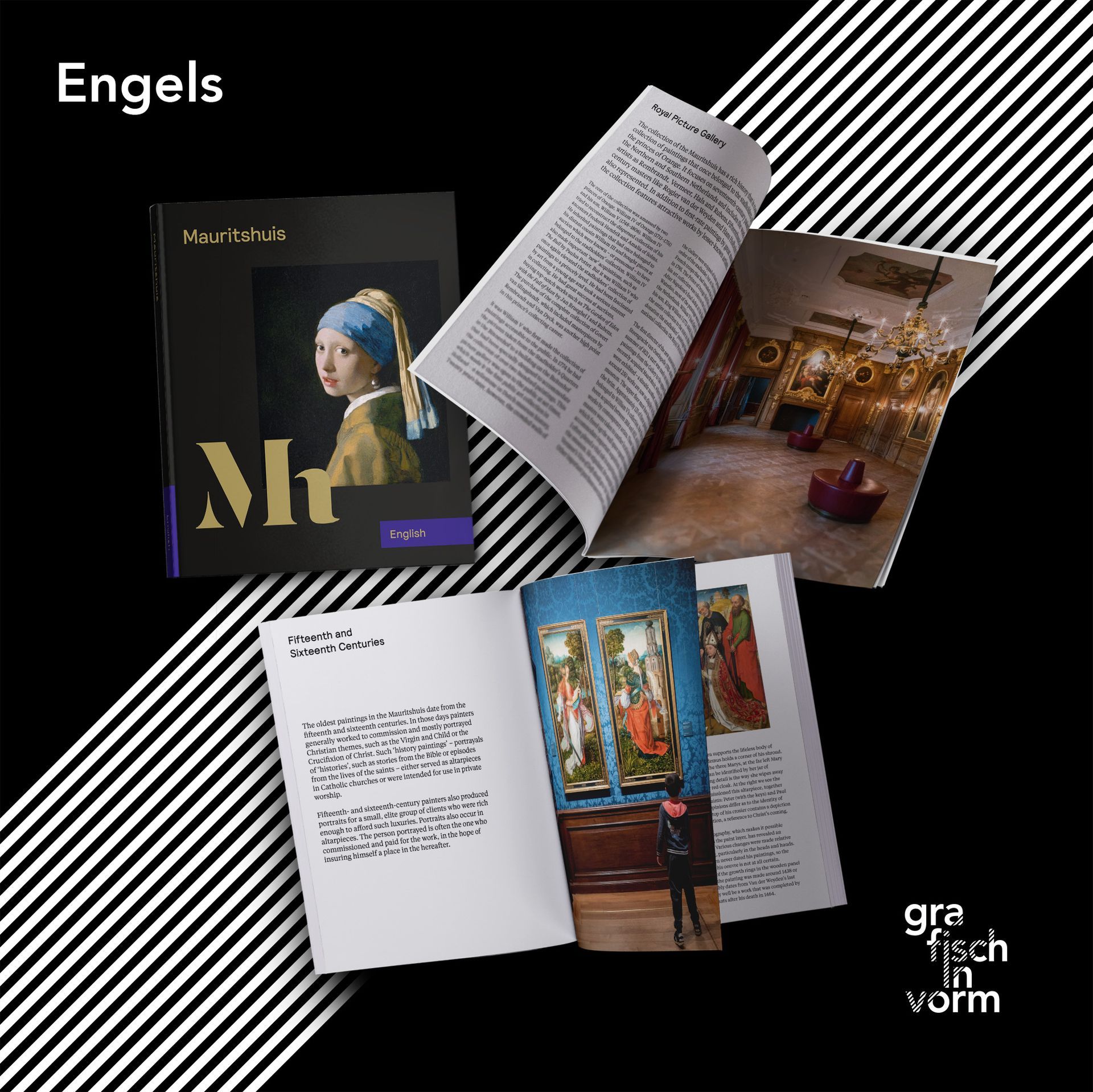
In 2017, 2020, and 2023, Grafisch in Vorm collaborated with Studio Dumbar and the Mauritshuis on a series of translations of the book "Mauritshuis Highlights." The book showcases the museum's highlights, the royal provenance of the collection, and the building's history—like a visit to the Mauritshuis itself.
The first series was published in five languages: Dutch, English, Japanese, German, and French. Chinese, Italian, and Russian followed (the latter was ultimately never printed). In 2023, all editions were technically revised and updated.
Structure and composition
A key aspect of this project was the technical DTP work behind the translations. All photographs are placed precisely the same way in every language – on the same pages, in the same format, and with identical color ratios. The full colors are produced in a single printing run, ensuring the paintings retain the same look in every edition.
Only the black layer is then printed per language, incorporating both the translated text and the black in the photos. This ensures a consistent end result and lower printing costs.
Efficiency in practice
Because the layout of all languages is based on a single print file, translations could be managed efficiently without any image shifting. This approach not only guarantees color fidelity but also a uniform page layout across the different languages.
The project is a prime example of technical precision in multilingual publishing, where graphic design and production process seamlessly integrate.


